November 10, 2021 | What is the Definition of Interaction Design(IxD)?

Definition of Interaction Design(IxD):
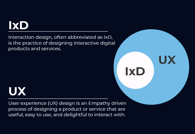
Under the roof of user experience design, interaction design falls.
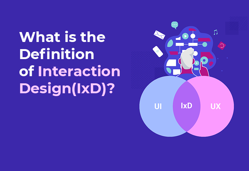
Interaction Design, or IxD, is the process of developing digital products and services that can be interacted with by users. Interaction design is a subset of UX that deals with designing digital products that interact with the end user. To be successful in this field, you must first understand how people interact with technology.
Predicting how users will interact with technology allows you to anticipate how the system will interact with the user, identify problems early on, and find new solutions.
What is the difference between Interaction Design and User Experience Design?

Many people are confused about the differences between Interaction Design and UX Design after learning about Interaction Design. The main difference between Interaction and UX Design is that IxD is solely concerned with how users interact with the system, whereas UX Design is concerned with usability but not exclusively.
Interaction Design Elements
The following are some essential elements of interaction design:
Motion
Motion is frequently a catalyst for action. When your finger clicks on the button, for example. There’s movement on your screen—a website loads, a text is sent, and so on. There is no interaction if there is no movement.
Space
Even at the subatomic level, all motion takes place in space, even if the boundary is hazy (Internet). Whether it’s a web page or a physical space, all interaction designers’ work in 2D and 3D spaces.
The interaction between physical and analogue space occurs frequently. For example, you can use your remote to adjust the TV volume, and the changes will appear on the digital screen.
Time
All of the interactions take place over the course of a few minutes. It can sometimes be as simple as clicking the mouse. Every movement through space necessitates a certain amount of time. A gamer can confirm that pressing the buttons takes time, with the fastest being eight milliseconds.
Interaction designers must be aware of the passage of time. Some tasks are difficult and time-consuming. For instance, looking for and purchasing products. Most e-commerce websites require you to log in, and this login is kept active for a certain period of time. Consider what would happen if the login session expired every few minutes. It’s unlikely that you’ll make a purchase from that website.
Interaction Design Dimensions
The 5D model is useful for fully comprehending what interaction design entails. Gillian Crampton Smith, an interaction academic, was the first to introduce this model. Kevin Silver added the fifth dimension to Gillian’s concept, which had only four before.
Words
Words play an important role in interaction design because it is all about communicating with users. Most people think of writing as simply putting words together. However, when it comes to choosing words for design, there’s a lot more to consider.
A sword can be as powerful as a correct word used at the right time. It’s as bad as not writing at all if you don’t think about who you’re talking to when you’re writing.
Consider the following scenario: Assume your product is aimed at retirees. Your customers, i.e. the retired, will not connect with your product if you write something that only the younger generation understands.
As a result, the terminologies you use, as well as the writing style you use, must all be carefully crafted to be familiar to the intended audience.
Representation in Pictures
In interaction design, visual representation refers to any graphical elements that users interact with, such as typography, photos, diagrams, and icons. The words used to communicate with users are usually supplemented by these visual representations.
UX design as a visual representation
Words are powerful, but visual representations are even more so. Using an icon that your users are familiar with, for example, will ensure that they understand what you’re trying to say right away. However, if the visuals fail to capture the user’s attention, they are unlikely to continue reading.
Space or Physical Objects
This is where the conversation happens. Design is interacted with by the user through physical objects. In an office cubicle, for example, users interact with computers and the mouse.
It is critical to have good visuals. However, if the elements aren’t placed correctly, they won’t have the desired effect.
A cluttered web design makes it difficult for users to interact with the product effectively because the elements are difficult to interact with.
Physical objects and spacing will vary from device to device, so designers must keep this in mind. Something that looks good on a laptop may or may not look good on a smartphone.
Furthermore, a person’s surroundings can have an effect on how they interact with a website or application. Is it being used on a moving train? Is it being used in an office cubicle?
Time
Time is used to measure a user’s interaction with the first three dimensions. Users must be able to track their progress through the use of motions and sounds.
Designers must also keep track of how many times a user interacts with the product and how they can customize the interaction later.
Assume a user is doing some online shopping. They’ve added the item to their cart and are about to complete the transaction. However, their payment was declined due to some issues. As a result, they opt to pay later.
As a result, the user must be able to pick up where they left off with their interaction. If a user must start from the beginning, they will not purchase from the website.
Behavior
Action and reaction are two aspects of behavior. The term “behavior” is used in interaction design to describe how users interact with websites and applications. What are the ways in which users interact with the products? Furthermore, user reactions, such as emotional responses or feedback, are included.
In terms of interaction design, these five dimensions refer to how users interact with and communicate with the system.
Interaction Design Principles
Usability
Designers must ask one question when discussing a product’s usability. “Can users use this product?” it asks. The fundamental requirement of interactive design is usability.
The usability of the product/services is now influenced by a few factors. They are as follows:
Learnability: How quickly can users pick up on how to use the product?
Flexibility: Does the product allow users to interact in a variety of ways? Efficiency refers to how quickly the user can finish the task at hand.
Error rate: How often does the product fail to function properly? Last but not least, how quickly can the system recover from a mistake?
User satisfaction: Does the interaction make the users happy? Is it up to their standards? Interaction designers familiarize themselves with the user’s mental model when designing actual products in order to create a product that is intuitive to use.
People-centered design
Designers should avoid designing for a hypothetical user when creating products or services. Personas are specific user groups that should always be considered when making design decisions.
In a way that the designer can understand and relate to, the persona encapsulates the specific data on the user group.
Iteration in Design
A designer understands that a design’s first draught will never be the final product. As a result, most designers make several iterations for a single problem. As a result, user testing is the only way to choose a functional design and reduce the number of design options (testing on real people).
Many designers are surprised when the testing phase of a design reveals that it did not pass the design phase. When this happens, they must go back to the whiteboard and come up with a new design.
Ergonomics
Interaction design requires the application of psychology principles because it is all about understanding the interactions between users and products.
This procedure aims to reduce human errors, increase productivity, and improve safety. Fitt’s law is used by designers to achieve this goal. Fitt’s law states that the time it takes to get to a target area quickly is proportional to the distance between the target and the target’s width.
To put it another way, the larger the object, the faster users can point to it.
This method can be applied both in real life, such as with your hand or finger, and virtually, using a pointing device. This rule is applied by web designers when creating buttons and menus.
Designing Interaction: Best Practices
When creating products with interactive elements, interaction designers should ask the following questions, according to usability.gov:
What about the product’s appearance gives users hints about how it works?
How long does it take for an action to be followed by a response from the product?
Are you adhering to industry best practices?
Is the data divided into seven chunks at a time?
Is the format familiar to the users?
What kind of feedback will the user get once they’ve taken action?
Are there any constraints in place to prevent errors in the design?
It’s all about interacting with your users in interactive design. As a result, make sure you’re using the best visuals and language possible. The way users interact with a digital product influences decision-making and other aspects of the user journey.
The five dimensions described above are included in the interaction design process:
Text, images, physical objects/spaces, time, and behavior. A designer’s primary goal is to make a user’s experience as simple as possible so that only the most basic information is required.

 .Net
.Net Vue.js
 Twilio
 Postgre
SQL
 PHP
PHP React.js
 Bootstarp
 MySql
MySql Laravel
 Woo
Commerce
 Firebase
 SQL
Server
 Angular
 Python
 ChatBot
 Wordpress
 Node.js
 Full
Stack
 MongoDB
 Drupal


