November 23, 2021 | Best Practices For User Onboarding-Onboarding UX Guide
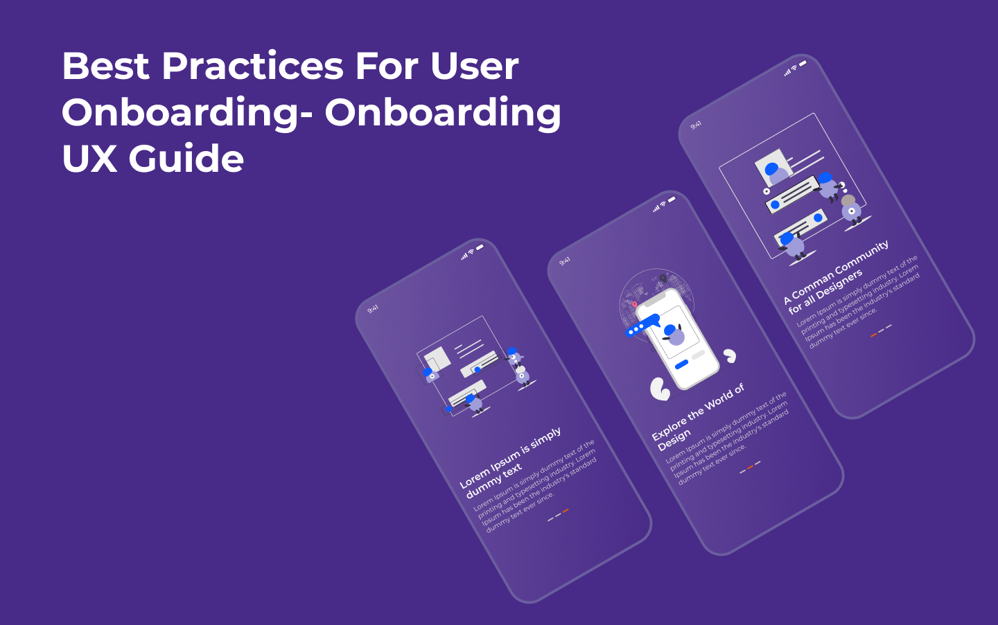
Designing a good user onboarding process is essential for product growth and keeping users coming back.
When they first start using your product, all consumers require some direction – it’s only natural that you lead them through the essential features of your design. A good user onboarding flow, on the other hand, is much more than a short tour of the product.
What is a user onboarding experience? A user onboarding experience is the first user experience (FUX) that a person receives when they download and use your product for the first time. It is frequently in the form of a brief walkthrough that teaches how to use the product’s primary features in short, basic stages.
If you’ve ever launched a new app for the first time and seen 2-3 series of screens with brief, polite sentences explaining what the app is for, you’ll be familiar with what to expect before you even start using it. Alternatively, if a fresh new social networking app walks you through making an account, setting up preferences, and adding a few hobbies to get started, you will be starting from a few steps beyond zero.
Why Is Onboarding Necessary?
Onboarding is a critical stage in a user’s journey. Consider onboarding to be similar to meeting a new person. In the realm of development, the first point of contact with your target audience is critical for making a favorable impression.
Onboarding helps consumers understand what they will need to do to receive what they need from an app or product. It’s a method of instilling confidence and trust in your users, which benefits them and contributes to higher conversion and retention rates for your company.
Best practices for ensuring a seamless customer onboarding experience:
1.Get to know the users you’ll be onboarding.
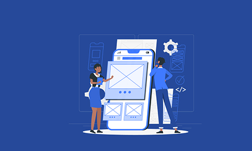
Users are people, and not all persons are the same. Therefore, even if you have a wide range of users downloading your goods, you can obtain a broad description of who those folks are. This information is crucial for planning the user onboarding experience.
We’ll assume you’ve already built most of the product features if you’re building an onboarding feature. But, hopefully, you took the time to do thorough user research.
2.Remove any impediments to the user’s Aha moment.

The “aha!” moment occurs when a user understands and internalizes the value of a product or service for the first time. A flash of insight, inspiration, understanding, or comprehension that, in the context of SaaS, refers to a specific software solution and its utility.
The Wow moment, Time to Wow, and Time to First Value are all phrases and metrics linked to this. These factors indicate how soon people perceive the value and how they react when they reach the “aha!” moment.
Including an element of surprise can help you develop an emotional connection with your user and help them understand the primary aspects of your product more quickly.
Tips for clearing roadblocks:
Do not necessitate the establishment of an account before attempting to use the product.
As late as possible, request user information.
3. Incorporate personality into the user onboarding experience.
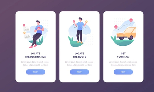
Make sure the tone and visual style of your user onboarding funnel match the rest of your product. Consider the terms branding and brand identity. They claim it only takes a few seconds to establish an opinion about someone. When users meet your product for the first time, they are just as prone to making quick judgments; therefore, you want that meeting to go well.
You want to introduce your users to the personality of your product immediately. It gives your brand a more personable appearance. If people have a positive initial impression of your product, they are more inclined to promote it on social media or tell their friends about it, attracting more users. As a result, they’ll be more likely to give it a higher grade as well.
4.Checklists and Progress Bars
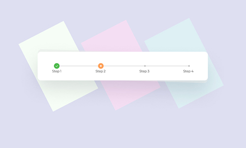
One method to keep people interested and move forward is showing them their progress in the onboarding process. People are motivated to achieve their goals when they see progress bars. They want to complete the tasks they begin and seeing the progress bar record their progress is a powerful motivator.
5 Helpful Hints (Tooltips) and Hot Spots
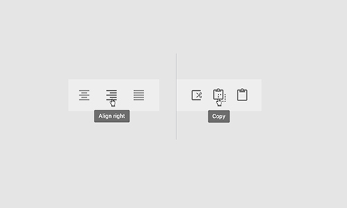
Some apps forego product tours and welcome screens in favor of showing users tooltips and hotspots. Because of the larger screen, real estate is more common in desktop and web apps than in mobile apps (and the ease of clicking on a tooltip or hot spot rather than trying to tap one).
6.Follow up: interact with additional information
You must use caution and apply this suggestion carefully. As we witnessed with WhatsApp’s short user onboarding journey, not all onboarding processes, contain enough information to necessitate sending emails or notifications to the user. However, if your product is difficult, you may consider providing a mechanism for users to get more knowledgeable.
You can provide a parallel side of user onboarding by sending emails with quick and visual tips on lesser features that didn’t cut the onboarding flow. Additionally, YouTube tutorials are an excellent approach to demonstrate how to use the product. They can provide detailed information without overburdening the initial onboarding flow.
Read Also:- What is the Definition of Interaction Design(IxD)?
 .Net
.Net Vue.js
 Twilio
 Postgre
SQL
 PHP
PHP React.js
 Bootstarp
 MySql
MySql Laravel
 Woo
Commerce
 Firebase
 SQL
Server
 Angular
 Python
 ChatBot
 Wordpress
 Node.js
 Full
Stack
 MongoDB
 Drupal